Clova: Elevating Stock Investment with a Refined Brand Identity
In the ever-evolving landscape of finance and investment, clova emerges as a cutting-edge stock investment management application, empowering individuals to navigate the world of stock trading with confidence and precision. Designed to cater to a diverse range of investors, clova stands as a testament to the power of streamlined user experiences and intelligent data-driven insights.
01
Design Objectives
The primary objective behind clova's brand identity overhaul was to create a visual language that resonated with the app's core values of transparency, trust, and sophistication.
02
Logo Design
At the heart of clova's brand identity lies a visually striking logo that seamlessly blends simplicity and depth. The wordmark, rendered in a bold, sans-serif typeface, exudes a sense of confidence and stability, echoing the app's commitment to providing a solid foundation for investment decisions. The subtle incorporation of a period at the end of the wordmark adds a touch of finality and punctuation, underscoring the app's focus on accuracy and precision.
03
Color Palette
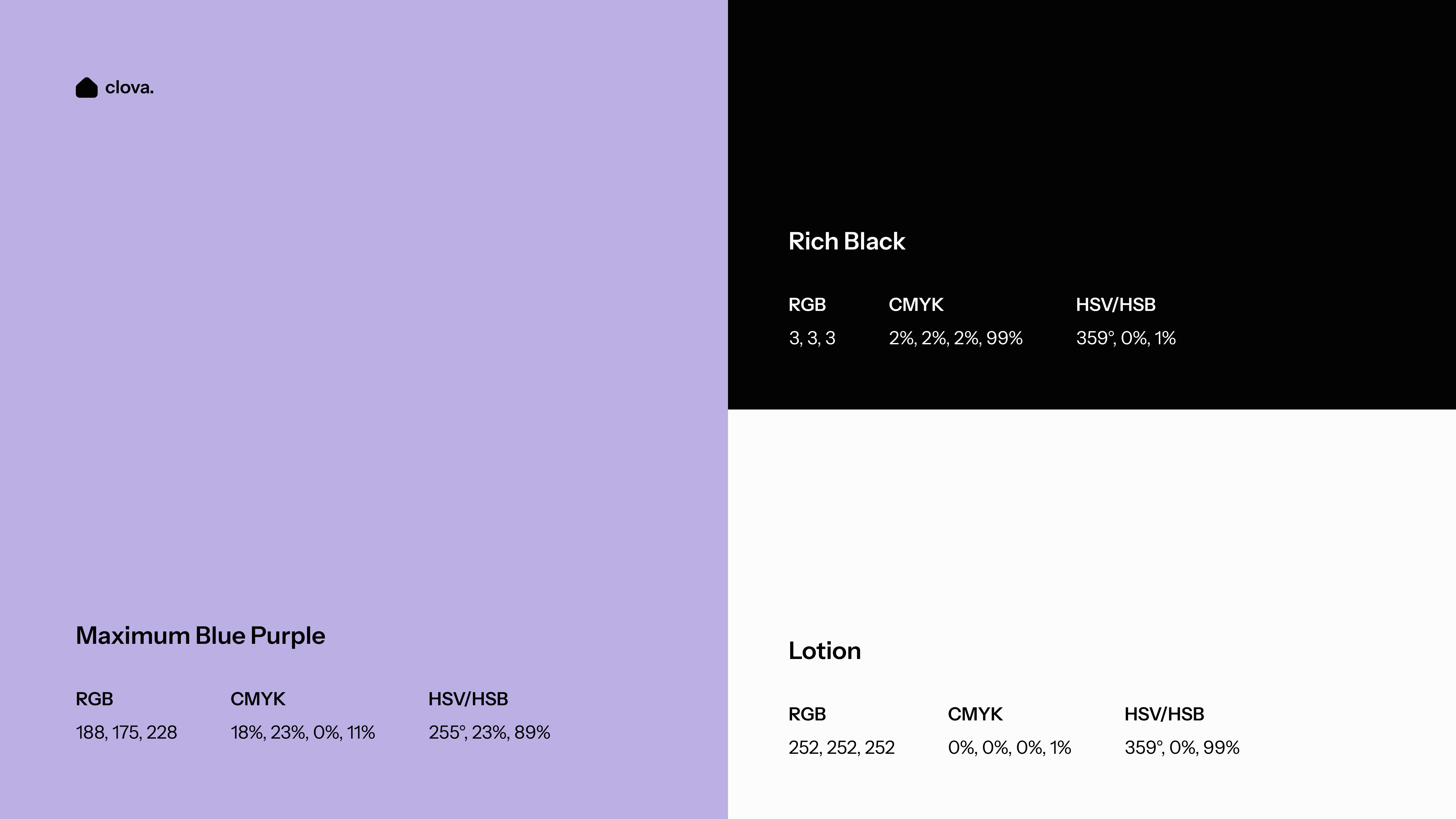
Clova's color palette is a thoughtful composition of hues that not only visually captivate but also resonate with the brand's core values and target audience. The primary color, a deep blue-purple (RGB: 188, 175, 228), exudes a sense of luxury, intelligence, and authority – qualities that are highly sought after in the investment realm. This hue is complemented by a rich black (RGB: 3, 3, 3) that adds depth and sophistication, while the soft, creamy white (RGB: 252, 252, 252) provides a clean and refined contrast.
04
Typography
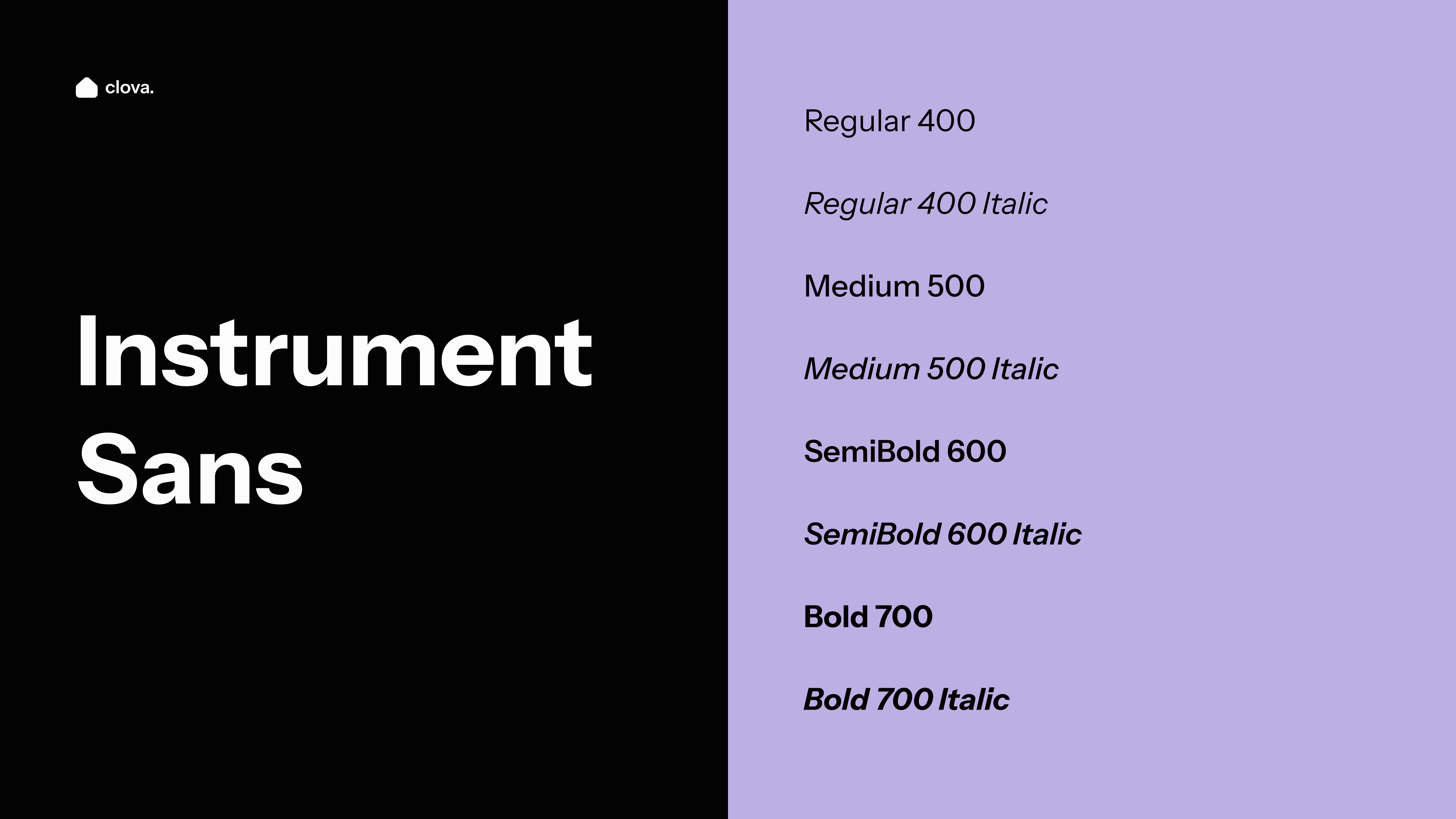
The typographic choices for clova's brand identity are a testament to the pursuit of legibility, modernity, and versatility. The primary typeface, Instrument Sans, is a contemporary sans-serif font that exudes a sense of clarity and professionalism. Its clean lines and balanced proportions ensure optimal readability across various digital platforms, catering to the app's diverse user base.
The Instrument Sans family offers a comprehensive range of weights and styles, from the crisp Regular to the bold and assertive Rich Black. This typographic flexibility allows for seamless hierarchical communication, enabling clova to effectively convey information and messaging with clarity and impact.
